Web forms play a big part in every day web use. If you build and/or run websites, chances are, you have a web form in it, whether it’s a simple contact form or a rich and robust web app. There are several ways to make sure your web forms are optimized for your users. Here are some tips for making sure that your form submission process is user-friendly.
1. Clearly Highlight Required Fields
It’s annoying as a user to submit a web form only to later find out that you’ve missed required input fields.
A common convention for highlighting required fields is to have an asterisk (*) beside their label. Explicitly stating that an input field is required or that the field is optional is a safe way to go.
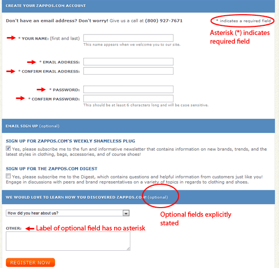 The Zappos.com registration web form highlights required fields with an asterisk (*). Optional fields are explicitly stated.
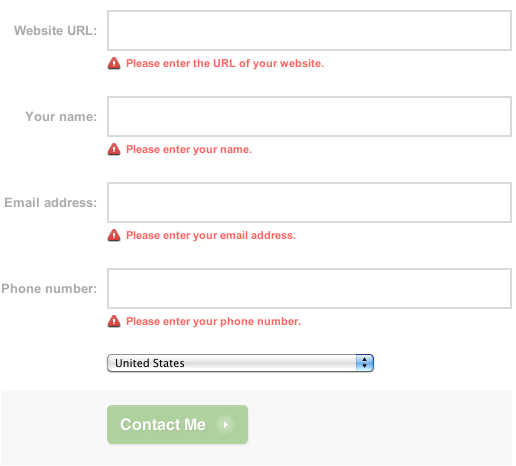
2. Provide User-Friendly and Descriptive Error Messages
I’m sure you hate it when you make a mistake in a web form and all the error says is "You must fill out all of the required fields below," when they should really provide a more specific error message like "You forgot to enter your e-mail address."
Performing real-time data validation as the user is filling out the web form is a good solution to ambiguous error messages. For example, immediately after filling out the email address input field, the web form should check whether it’s in the correct format, and if it isn’t, the user is immediately notified.
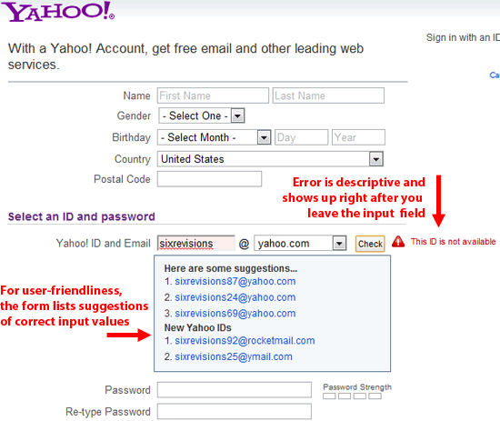 Yahoo!’s sign up form provides meaningful real-time error messages even before the form is submitted.
Read about best practices for hints and error-validation in web forms.
3. Use Client-Side (JavaScript) Data Format Validation
Using JavaScript data validation saves the user time, as well as reduces the amount of work your web server has to perform to process incoming web form submissions. Client-side error validation allows you to let users know they’ve made a mistake right away, instead of after they’ve submitted the form. This is good for any input fields that don’t need to check your database; things such as making sure the provided email address is in the correct format or that a phone number only contains numbers.
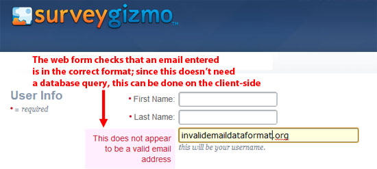 SurveyGizmo’s sign up form lets you know that the format of the email address you entered is invalid.
4. Visually Style Focused Form Fields to Let Users Know Where They Are
Make sure that you visually style input fields so that it is very apparent which field the user is on. You can do this by using the CSS :focus pseudo-class selector.
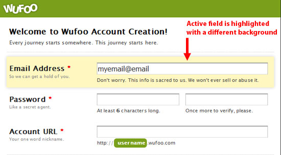 Wufoo’s web form visually styles the active input field by giving it a distinctive background.
Make the input field have a different border color at the minimum — by default, web browsers will do this for you, but make sure that the default color is distinctive against your website’s design.
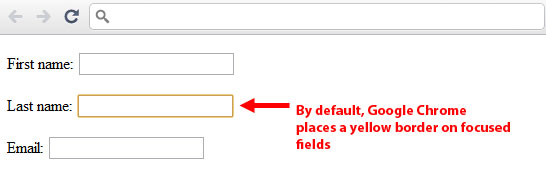 Google Chrome’s default style for a focused input field is to provide it with a yellow border. In Firefox, it’s a faint blue border.
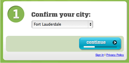
5. Show Progress Clearly
If your web form is big and it spans across multiple pages (or has several steps), make sure that you provide the user with constant feedback on their progress to let them know how much more time they will require to finish the web form submission process. This is common in cases such as an online survey form with many questions or an e-store’s checkout process.
All it takes is displaying "Step 4 out of 5," or something of that nature. If they keep clicking "Next" buttons with no clear vision of when they’ll be done, they’ll most likely stop sooner than you’d like.
 Amazon.com’s checkout process has 4 pages. The form shows you where you are and how much more there is to fill out.
Of course, the better alternative would be to shorten your web form — but barring that option, at least give the web form user an indication of where they are in the completion process.
6. Save/Cache Form Data Periodically
Forms that go through multiple pages or steps are prone to user errors. To avoid data loss, you definitely want to implement a way to save your users’ inputs in either a session or cookie variable. This makes the web form more fault-tolerant, and improves your chances that the form will be completed even after accidents such as the user navigating away from the web page. Having to re-fill out the web form may discourage users from completing it.
7. Ditch the Default "Submit" Text
Instead of having your web form’s submit button say "Submit," have it remind the user what it is they’re doing, like "Sign up now," or even better, let the user know of the advantages of filling out this form.
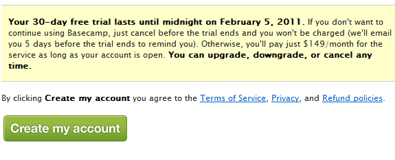 Basecamp’s signup form replaces the default "Submit" text with something more useful.
8. Your "Cancel" Button is a Major Distraction
If you were at a store buying a new shirt and the salesperson asked you, "Are you sure you really want to get this shirt?" would you continue to buy the shirt? Probably not. Maybe you’d be hesitant; is the salesperson telling you the shirt doesn’t look good on you?
Same goes with your web forms; having a "cancel" button may make your users think twice about what they’re filling out.
9. Show Users the Proper Input Format
If you’re asking your users for a specific input format — such as a phone number or credit card number — let them know what you’re expecting. If a password has to have a certain number of characters, or if it must contain certain combinations of characters, clearly describe these requirements. This reduces ambiguity and makes filling up the form quicker.
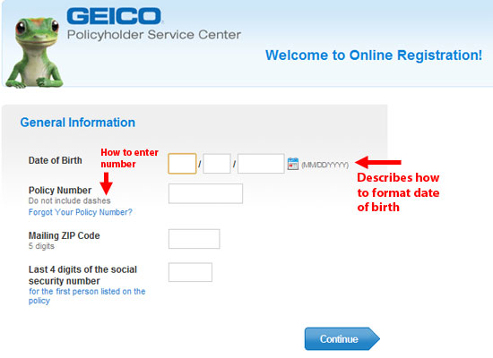 The Geico registration form provides unambiguous instructions on what format they’re expecting.
10. Single Column Vertical Forms Are Better
According to an eye tracking study by cxpartners, a user experience design agency, scanning down the form is preferable to scanning from left to right. It reduces the number of eye movements you need to make in order to fill out the form.
Single Column Example
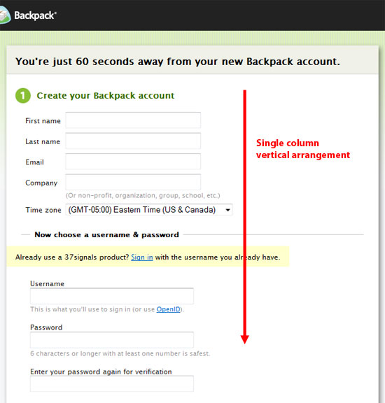 Backpack’s signup form is oriented vertically in one column.
Multicolumn Example
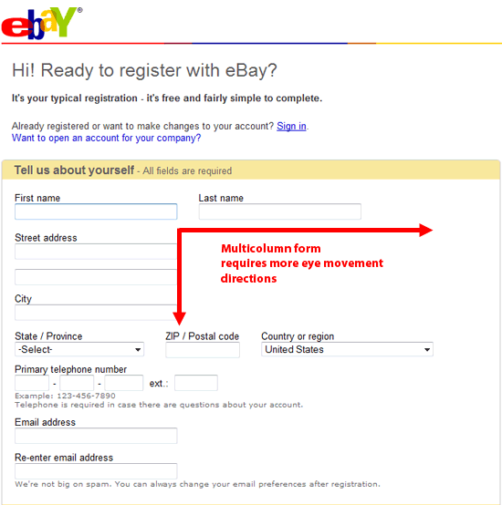 A counter-example, eBay’s multi-column signup web form requires users to fill out the form up and down as well as left to right.
Showcase of Excellent Web Forms
For inspiration, here are a few excellent web forms.
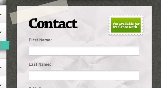
Alexandru Cohaniuc
Alexandru Cohaniuc’s web form looks absolutely stunning as far as design and functionality goes. It clearly lets you know whether he’s available for freelance work, it has easy-to-read labels and has input fields with clear and legible type.
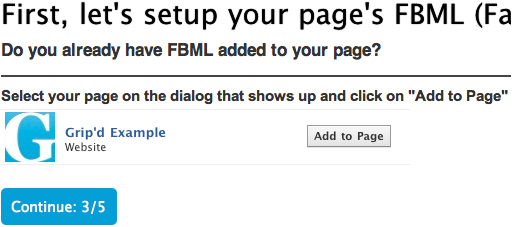
Grip’d Custom Facebook Tab Creator
Grip’d's custom Facebook tab creator lets you know exactly what step you’re in, along with big buttons that attract a user’s attention to keep going through the process of generating a custom Facebook tab.
Groupon
Groupon’s web form clearly lets you know where you are in the process of signing up. They do an amazing job at effectively using a multi-step registration form.
KISSMetrics
KISSMetric’s form shows a great example of web form design along with JavaScript validation. When you make a mistake, you’ll know about it right away.
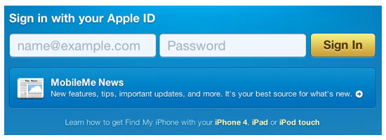
MobileMe Sign In
Apple’s MobileMe login form is a great example of form design. The call-to-action button is clear and the :focus style on the form field is clearly visible.

Web Form Tools and Resources
Here are a few resources and tools for working with web forms.
Wufoo
This web app allows you to generate your own forms and gives you the code necessary to embed the form in your web pages. They handle analytics and even payments for you!
Contactable
A jQuery plugin that lets you easily create contact forms and feedback forms anywhere on your site. It’s extremely easy to use and provides a great result.
Changing Form Input Styles on Focus with jQuery
This is a tutorial showing you how you can use jQuery to let your users know where in the form they currently are.
Form field hints with CSS and JavaScript
A tutorial that will teach you how to show form hints when users click on a field. This is a great way to show your users specific formats for phone numbers and other fields.
LiveValidation
A way to easily provide live field validation as the user types with JavaScript. You can configure it to work in pretty much any way you want.